

Why presenting a color palette alone doesn’t work
At some point, most founders are asked to approve a color palette.
A few cute swatches. Some hex codes. And an immediate, silent panic spiral of: “Am I supposed to feel something right now?”
Early in my freelance era, I followed what I thought was the correct branding order of operations:
Brand strategy
Visual exploration (hello, color palette)
Brand design
Client handover
Very professional. Very logical. Very “this is how it’s done.” And on paper? Flawless.
In real life? Presenting a color palette on its own almost never hit. Not because the colors were bad. But because color, without context, is basically just vibes with no plot.
Color alone is a personality test with no questionsA color palette by itself is abstract at best, confusing at worst.
That muted green? Soothing in one context. Accidentally 2012 in another.
Deep black? Luxury website energy. Absolute mood killer on Instagram.
Warm neutral? Minimal and chic… or unfinished and “are we still loading?” depending on how it’s used.
For non-designers (aka most founders), this is a setup. You’re being asked to approve something highly visual without being shown how it actually behaves in the wild.
That’s not a decision issue. That’s a missing-context issue.
Colors don’t speak until they’re in the group chatHere’s the realization that changed my process entirely:
Colors don’t mean anything until they’re doing something.
Color perception shifts based on:
Typography (soft? sharp? yelling?)
Imagery and photography
Layout and spacing
Contrast and hierarchy
Where the color shows up (backgrounds, accents, UI, content)
That’s how the same palette can feel:
Calm on a website
Loud on Instagram
Corporate in a deck
Editorial in print
Check out the example below to see what I mean:
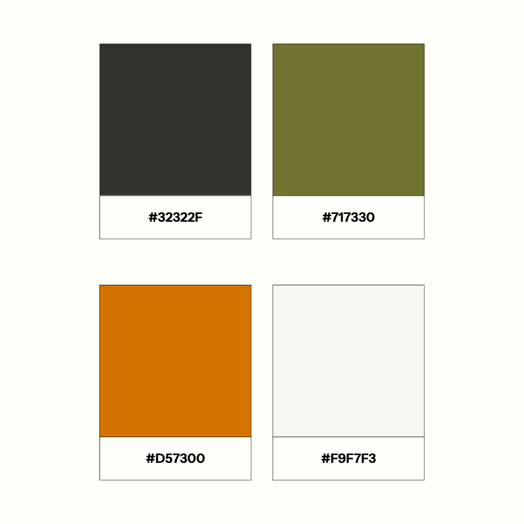
Color palette shown in isolation. Looks nice. Means nothing.
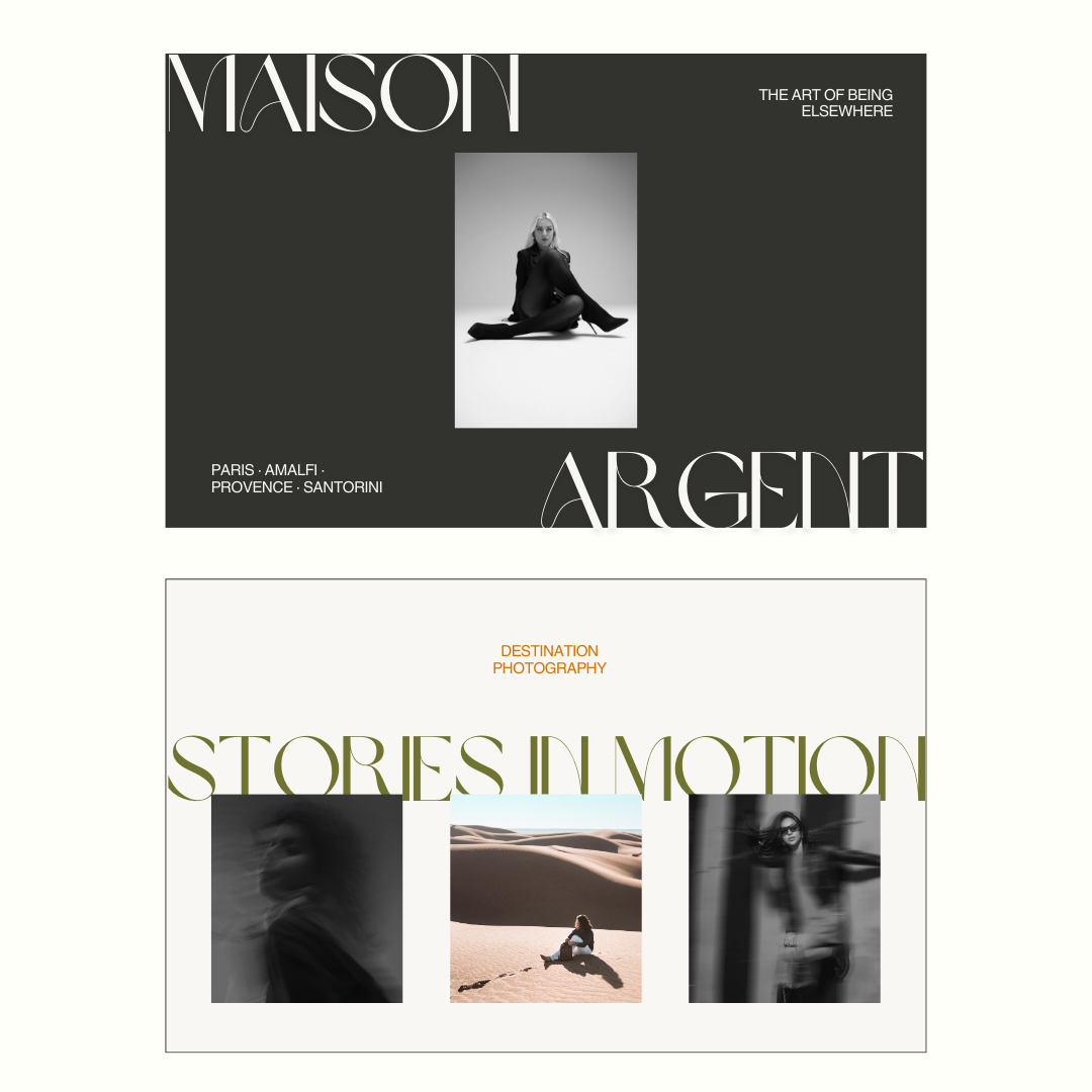
Color palette implemented in a hero banner. Where the colors start making sense.
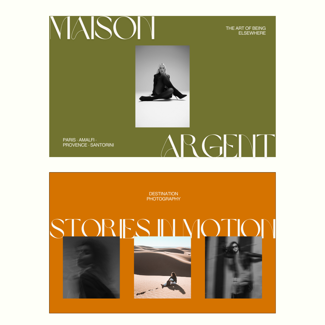
Same colors, reinterpreted.
These are from the same color palette. Totally different personalities.
The hex codes didn’t change. The context did.
What I do instead now (because we’ve learned things)I don’t present color palettes as standalone moments anymore. Color exploration always shows up in motion, paired with real application, like:
A homepage or landing page mockup
An Instagram grid that actually looks like Instagram
Brand photography direction with color doing its thing
A key website section where hierarchy matters and chaos is not invited
The format depends on what the business needs most. The rule stays the same.
Clients shouldn’t have to imagine a future where this works. They should be able to see it working now.
Why founders actually like this approachThis way of working:
Dramatically reduces “I don’t know, something feels off” feedback
Leads to faster, more confident yeses
Keeps visuals aligned with business goals — not personal mood swings
Saves time, money, and a whole lot of unnecessary redesigns
Most importantly, it reframes the conversation.
Instead of: “Do I like this color?”
We get to ask: “Does this feel right for the brand we’re building?”
That’s the question that actually matters.
A small shift that made everything easierThis wasn’t a dramatic pivot. No brand awakening montage. Just a smarter way of working, learned the hard way.
Color isn’t decoration. It’s a system — and systems only make sense in use.
Once I stopped asking clients to judge colors in isolation, brand decisions got clearer, faster, and way more grounded.
So if you’re building a brand and struggling to see how it all comes together, this is exactly why my process looks the way it does now.
Less abstraction. More application. Way fewer awkward palette approval moments.