

About -
About -

the origin story
How it beganMy first taste of design was for a data visualization project when I used to work at the UN. Yep. I was the person turning soul-draining spreadsheets into visuals people actually chose to look at. Somewhere between those charts and color palettes, I had the oh wait—this is my thing moment. Turns out, taking complex, abstract ideas and turning them into something beautiful and easy to digest lights me up. So I followed that breadcrumb trail straight into branding and never looked back. That was 7 years ago.
How it's goingToday, I partner with startups and small branding agencies - the wonderfully chaotic ones with half-formed ideas, five Slack channels on fire, and at least one Google Doc named “final_FINAL_v3.” That chaos? Weirdly my natural habitat. I bring the calm, structure, and “okay, let’s get this locked in” energy they swear they needed yesterday.
here's your partIf your idea is still half-baked or living rent-free in your brain with zero structure, welcome — you’re in the perfect place. I’ll help you shape it, polish it, and turn it from “ehhh” to “hot damn, that’s it.”
Brand Ethos

-
I turn the messy, the abstract, and the overwhelming into design that feels intentional, digestible, and actually enjoyable to interact with. Chaos is the input; clarity is the output.
-
Brands grow, shift, and evolve — and that’s the good part. We iterate, refine, test — because momentum beats perfection every single time. If your idea has pulse, it’s ready enough. We’ll optimize as we build.
-
Pretty is nice, but purpose is better. Every choice — color, layout, word, interaction — is rooted in communication, behavior, and how people actually think. Design with depth hits different.


The receipts
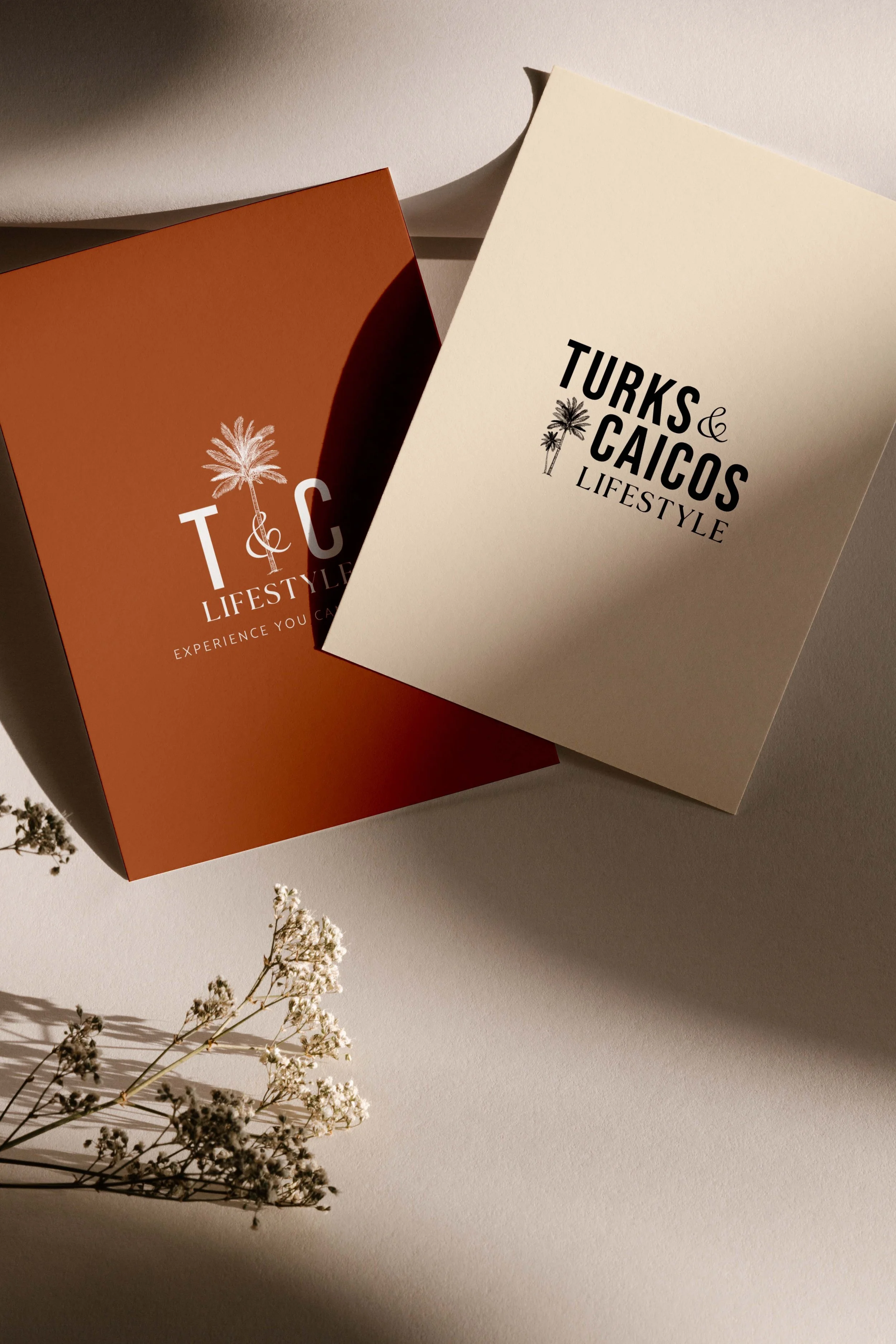
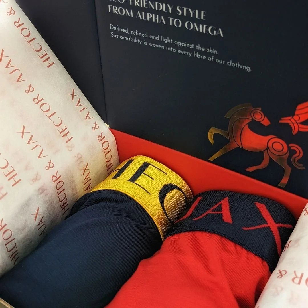
Scroll through the work to see the brands I’ve sharpened, the messy ideas I’ve cleaned up, and the visuals that hit harder because the strategy underneath is solid. These are the receipts… and they’re damn good.

